Uniform Change

Change up the uniform?

  • Yes

    Votes: 17 18.5%
  • No

    Votes: 43 46.7%
  • Replace the color rush with retro scheme

    Votes: 32 34.8%

  • Total voters
    92

Cyrus12

Well-known member
Joined
Aug 16, 2013
Messages
17,596
Reaction score
4,946
Location
North of the Wall
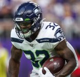
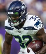
Since there isnt much to talk about other than Russ's hair...what are your guys thoughts on the current uniform? What would you like to see changed if anything?

Imo the color rush is awful and I'd rather see a uniform and helmet scheme from the 80s era.

For the main uniform I'm happy with the helmet and pants but have never been fond of the nike logo on the sides. I'd rather see the hawk logo.
 

sutz

Well-known member
Joined
Mar 1, 2007
Messages
29,261
Reaction score
5,266
Location
Kent, WA
Early in the offseason for the first uniform thread, but I guess we're desperate. :twisted:
 

Seanhawk

New member
Joined
Apr 30, 2009
Messages
6,819
Reaction score
0
I wouldn't really change anything about the helmets or pants either. The jerseys though feel and have always felt off. Like a Nike experiment, but still generic enough that they look like something a kid could and would create in Madden.
 

Appyhawk

Moderator
Moderator
Joined
Nov 27, 2019
Messages
3,675
Reaction score
1,399
Location
Ranch in Flint Hills of Kansas, formerly NW Montan
I always thought our unies in the 80's were the best in all of football. Still wearing a sweatshirt 30 yrs old cause it's my fave, even though I have a nice new one with embroidered hawk on front.
I'll line up with Cyrus12 OP game plan.
 

AROS

Administrator
Administrator
Moderator
Joined
Feb 23, 2007
Messages
19,030
Reaction score
7,835
Location
Sultan, WA
Love our 80's era retros, but love our current uniforms just as much. The only thing I would change - and I have been clamoring for this change for decades - is to put the Hawk logo back on the sleeves and make it large like the retros. They had the logo on the sleeves during the Hasselbeck/Holmgren Era but it was too small. Now they don't even have the logo on the sleeves. Forwards, not backwards Nike!
 

Largent80

New member
Joined
Mar 1, 2007
Messages
36,653
Reaction score
5
Location
The Tex-ASS
I love the color rush. I love the retros, I love the all blues, what's the problem?

I especially liked the green jersey blue pants version.

What I miss is the big Hawk Head logo on the sleeves.
 

AROS

Administrator
Administrator
Moderator
Joined
Feb 23, 2007
Messages
19,030
Reaction score
7,835
Location
Sultan, WA
Something like this...Make it so Nike/NFL!
 

Attachments

  • 082019-carson.jpg
    082019-carson.jpg
    178.4 KB · Views: 2,743

SNDavidson

Well-known member
Joined
Sep 29, 2009
Messages
2,697
Reaction score
615
I like the idea of sleeve hawk again and agree it should be large, but it can’t be close to same as helmet, so for me you’d need to do a zoomed in version of the helmet hawk to make that work.
 

QuahHawk

Well-known member
Joined
Dec 12, 2009
Messages
5,641
Reaction score
108
Location
Issaquah, WA
I like the logo on the sleeve too. Wonder if they will try to get the alternate logo on the uniform.
 

Attachments

  • alt logo.jpg
    alt logo.jpg
    91.2 KB · Views: 2,731

AROS

Administrator
Administrator
Moderator
Joined
Feb 23, 2007
Messages
19,030
Reaction score
7,835
Location
Sultan, WA
SNDavidson":2ph8jld4 said:
I like the idea of sleeve hawk again and agree it should be large, but it can’t be close to same as helmet, so for me you’d need to do a zoomed in version of the helmet hawk to make that work.

Yeah that was more the look of the retros...For contemporary it would make sense to do the zoomed in version. I was just too lazy to do it for this quick and dirty shot, lol.
 

AROS

Administrator
Administrator
Moderator
Joined
Feb 23, 2007
Messages
19,030
Reaction score
7,835
Location
Sultan, WA
Wenhawk":1o388vdg said:
I like the logo on the sleeve too. Wonder if they will try to get the alternate logo on the uniform.

Oh dear baby Jesus no!
 

KinesProf

Well-known member
Joined
Jan 28, 2020
Messages
734
Reaction score
556
I really like the current uniforms. Though I would prefer less head to toe navy when at home. I would like to see the gray pants used as the primary pants home and away.

I'm too young to have any memories or fondness of the Largent-era uniforms. I understand nostalgia, but they don't look particularly great to me, and the bird looks pretty lethargic compared to the modern logo.

I think guys tend to tailor and crop their sleeves far too regularly to add a sleeve logo. I can't think of which teams are currently doing that.
 

James in PA

Well-known member
Joined
Dec 4, 2013
Messages
4,846
Reaction score
4,526
Our alternate logo looks like someone said: “OK, you have 30 seconds to design a new logo in Photoshop using only the current logo. Go!”


Sent from my iPhone using Tapatalk
 

Attyla the Hawk

Well-known member
Joined
Mar 11, 2013
Messages
2,559
Reaction score
47
small change, but wonder if they can color rush green on the facemasks.
 

AROS

Administrator
Administrator
Moderator
Joined
Feb 23, 2007
Messages
19,030
Reaction score
7,835
Location
Sultan, WA
PLEASE allow our old retros to be used once or twice a year!!
 

chris98251

Well-known member
Joined
Feb 27, 2007
Messages
39,619
Reaction score
1,624
Location
Roy Wa.
Really going back to the Silver or they would probably be more of a flat steel Gray now with the new logo would be a compromise of sorts but allow us to wear just about every actual uniform combo going forward.
 
Top