Rumors of new uniforms

12AngryHawks

Well-known member
Joined
Mar 9, 2019
Messages
1,667
Reaction score
1,928
Location
Central Valley, CA

According to the since-deleted tweet in the article, this is what our new home uni's could look like. Silver helmet & pants, and the Seahawks logo on the shoulder. Thoughts? I know it's just a rumor, but hey, it's the offseason, the time to talk about rumors. I think I actually like this design better than the current ones. Looks like a combo of the current & the retro uni's.
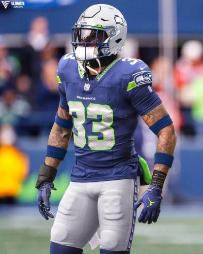

GD NaBgaUAADwCT
 

Wheetie

Well-known member
Joined
Jan 7, 2019
Messages
420
Reaction score
529

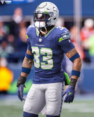
According to the since-deleted tweet in the article, this is what our new home uni's could look like. Silver helmet & pants, and the Seahawks logo on the shoulder. Thoughts? I know it's just a rumor, but hey, it's the offseason, the time to talk about rumors. I think I actually like this design better than the current ones. Looks like a combo of the current & the retro uni's.


View attachment 63619
I hate them...oops sorry, I just hate the player
 

CPHawk

Well-known member
Joined
Apr 30, 2009
Messages
4,977
Reaction score
1,027
For the record years ago they had a vote for Blue or Silver helmets, and I voted for silver. Hope the NFL lets us go back to them. Apparently the eagles tried to go back to silver and green, and the NFL told them no.
 

Maelstrom787

Well-known member
Joined
Jan 28, 2011
Messages
11,914
Reaction score
9,753
Location
Delaware

According to the since-deleted tweet in the article, this is what our new home uni's could look like. Silver helmet & pants, and the Seahawks logo on the shoulder. Thoughts? I know it's just a rumor, but hey, it's the offseason, the time to talk about rumors. I think I actually like this design better than the current ones. Looks like a combo of the current & the retro uni's.


View attachment 63619
This is God awful.

Either go traditional or don't. This has no identity. Two different types of striping for no reason. Number placement is off on the front.

Your uniform should never be confused about what design school it belongs to or what impression it is meant to impart. This is a mess.
 

Seahawker

Well-known member
Joined
Aug 29, 2018
Messages
3,351
Reaction score
974
This is the exact uniform I have been hoping for since they originally changed from the old-school's. I'd rather have the original green trim but would settle for the action green, it looks fine.
This would be the PERFECT time to upgrade to this new optimal look!
Somebody start a poll to check the pulse of .net.
GD NaBgaUAADwCT
 

sutz

Well-known member
Joined
Mar 1, 2007
Messages
29,295
Reaction score
5,305
Location
Kent, WA
Our first uniform thread of the offseason. A new record on how fast it turned up. :LOL:

Not sure about what shade of blue that is. Looks quite washed out TBH. A return to the old 80's/90's look wouldn't bother me much, though I guess we should stay with the new logo. As long as it's just a highlight color, which green used is not important to me.
 

Aircrew

Well-known member
Joined
Sep 25, 2016
Messages
726
Reaction score
1,252
Location
Eastern Washington
While I'd prefer the straight up retros, I'll take these. I'm so completely done with the monochromatic trend. It reminds me of the teal fad of the 1990's, just so cringe.
 

OneLofaTatupu

Well-known member
Joined
Mar 4, 2007
Messages
3,558
Reaction score
1,805
Location
Seattle, WA
This is God awful.

Either go traditional or don't. This has no identity. Two different types of striping for no reason. Number placement is off on the front.

Your uniform should never be confused about what design school it belongs to or what impression it is meant to impart. This is a mess.
Yep. Don’t mix. I almost threw up my vomit.
 
Joined
Mar 13, 2007
Messages
413
Reaction score
21
I don't necessarily love that look, however I am very ready for a new look that is for sure. Love our current unis but time for a refresh imo...
 

renofox

Well-known member
Joined
May 10, 2009
Messages
4,218
Reaction score
3,535
Location
Arizona
I just remember how pissed I was when they went to the blueberries and put the Nike logo where the Seahawks logo should have been.

I wasn't the only one calling the team the Seattle Nike's. Sellout.

We still have that frigging logo sitting there and it  still passes me off.

We don't even need a sleevehawk. Just cover up that stupid logo with a large Seahawks logo and I'll be happy.
 

IndyHawk

Well-known member
Joined
Dec 19, 2013
Messages
8,009
Reaction score
1,644
Remember this is just a rough mockup.
I'd prefer the ones I saw years ago and posted on here but
they are on another computer and I'm not digging through
thousands of posts to find it.
However stay tuned I'll pull from that laptop soon.
Looks much better than the above crap.
 

AROS

Administrator
Administrator
Moderator
Joined
Feb 23, 2007
Messages
19,050
Reaction score
7,893
Location
Sultan, WA
That particular rendering is just some rando's take. It's doubtful to be a true representation of the tones and PMS codes the team would go with. Just an approximation. For the record, give or take some design elements, I'm all for that update!
 
Top