uniforms

ZorntoLargent

Active member
Joined
Jul 27, 2013
Messages
1,510
Reaction score
7
Ruminator":2n44z34h said:
Still amazed that Nike was allowed to be featured so prominently on the sleeves of our home jerseys. We're the Seattle Seahawks, not the Seattle Swooshes. This is the only thing I disapprove of in the home jerseys.

.
What about the Puma and "W" Wilson logo on the 80's 90's and the giant Reebok logo on the 00' jerseys???
 

Ruminator

Well-known member
Joined
May 1, 2012
Messages
2,148
Reaction score
945
Location
Central Florida
ZorntoLargent":1eb9hqc0 said:
Ruminator":1eb9hqc0 said:
Still amazed that Nike was allowed to be featured so prominently on the sleeves of our home jerseys. We're the Seattle Seahawks, not the Seattle Swooshes. This is the only thing I disapprove of in the home jerseys.

.
What about the Puma and "W" Wilson logo on the 80's 90's and the giant Reebok logo on the 00' jerseys???

Those are much better. They hardly pop out like the current swoosh set on a large neon green feather on each sleeve, and they were not so blatantly incorporated within the team's color scheme. Duplicating one of the team's colors is OK and I've seen it done on many other team's uniforms, but inset in the large neon green feather makes it look like a large Nike badge. Oh well, it is what it is.
 

SoCalSeahawk

New member
Joined
Mar 5, 2007
Messages
430
Reaction score
0
Location
San Diego
el capitan":2dgwpbgj said:
The OP's gonna be pissed when he finds out Ruskell used the Transition tag.

No worries, we will have the opportunity to match any offer...
 

ZorntoLargent

Active member
Joined
Jul 27, 2013
Messages
1,510
Reaction score
7
Ruminator":3imvjim1 said:
ZorntoLargent":3imvjim1 said:
Ruminator":3imvjim1 said:
Still amazed that Nike was allowed to be featured so prominently on the sleeves of our home jerseys. We're the Seattle Seahawks, not the Seattle Swooshes. This is the only thing I disapprove of in the home jerseys.

.
What about the Puma and "W" Wilson logo on the 80's 90's and the giant Reebok logo on the 00' jerseys???

Those are much better. They hardly pop out like the current swoosh set on a large neon green feather on each sleeve, and they were not so blatantly incorporated within the team's color scheme. Duplicating one of the team's colors is OK and I've seen it done on many other team's uniforms, but inset in the large neon green feather makes it look like a large Nike badge. Oh well, it is what it is.

The entire argument makes little sense. It's on ALL NFL jerseys. It's not like they singled us out.
It's on the sleeve of EVERY team. The Reebok was on every teams jersey...................

Our sleeve design is the reason it's set on a larger neon "feather".
 
A

Anonymous

Guest
Count me as one of the ones who was wondering what the hell was going on when they unveiled the Seahawks Blue second-gen uniforms. That silverfish greenish bluish color took me YEARS to warm up to. But after the getting-used-to part was over, the all-one-color trend made it cool. Now the all-blue home uni combo is a fixture that won't go away.

Loved the originals, after the sock-stripes were dropped and the sleeve-Hawk was added, but the new uniforms are sick. Love the preponderance of Neon green, and I'm glad we got away from having the team name in the same font as a bunch of other teams in the center of the chest.

I'd like to see us mix it up a little more, that's all. I mean, if we have options...
 

jacobsod

New member
Joined
May 16, 2014
Messages
145
Reaction score
0
Location
Morenci, AZ
The new uni's are bad arse! The wife and I both love 'em. Wish we'd never wear white-white, tho. Only use combos of blue and wolf grey.

Always loved the 12 "feathers" all over repping the fans. I don't think any other team has something like that, do they?

I actually LIKE the Nike swoosh. Nike is a PNW company. I have no idea where Reebok is housed..

Oh, and whoever brought up the Bucs...yeah..eww on the 80's digital clock look. What time is it? Time to loooose! lol
 

HawkFan72

Active member
Joined
Mar 3, 2007
Messages
16,570
Reaction score
1
Location
Bay Area, CA
Zebulon Dak":23h7r6mz said:
New Bucs and Jags helmets are sick. I wish Buffalo, Jets & Giants would all go back to their 90's helmet designs.

The new Bucs helmets are sick. The rest of their uniform is just awful.
 

BlueTalon

Well-known member
Joined
Mar 3, 2007
Messages
9,015
Reaction score
1,712
Location
Eastern Washington
When I first saw the new uniforms, I hated them, but I also could tell they would grow on me really quickly. But that happened a lot sooner than I expected, literally about a half hour. It was easy to pick apart the details of what I didn't like about the new uniform when one player was modeling it, but imagining 11 players lining up on the field with it kinda took my breath away.

At first, the Nike thing was one of the details I didn't like. Now, I don't care. The only thing I don't like about the new uniforms now is their use of different materials in the body of the jerseys. Now, when players get hot and sweaty, they look like teletubbies.
 

Our Man in Chicago

New member
Joined
Dec 29, 2013
Messages
1,188
Reaction score
0
Maulbert":15oamihm said:
Or the Jags helmets. They look like the team ran out of spray paint and couldn't afford more.

Deep-cover Khan sources tell me that spray paint in London is even more expensive, which is keeping the move to Wembley on ice.

shahid-khan.jpg
 
Joined
May 3, 2009
Messages
424
Reaction score
9
Maelstrom787":1yetdcdd said:
Part of me wishes I could see the previous 2002-on uniforms in the Nike template with the tighter fit, different materials, and lower front number positioning. Just out of curiosity.

You mean like this? - Note, this image appears in another .Net thread somewhere as well:

Nike-Seahawks-unis-630x390.jpg
 

Pak-Man12

New member
Joined
Jan 3, 2015
Messages
27
Reaction score
0
Location
Tacoma, WA
MissoulaHawkFan":ey4uvqts said:
Maelstrom787":ey4uvqts said:
Part of me wishes I could see the previous 2002-on uniforms in the Nike template with the tighter fit, different materials, and lower front number positioning. Just out of curiosity.

You mean like this? - Note, this image appears in another .Net thread somewhere as well:

Nike-Seahawks-unis-630x390.jpg

Would be nice to wear as an alternate, except as already mentioned Mr. Allen hates this uniform.
 

Timberhawk

Active member
Joined
Dec 29, 2012
Messages
328
Reaction score
34
Here is a link to an article detailing some of the history behind the old and current uni's.

Excerpt:

http://12thmanrising.com/2013/07/04/the ... e-uniform/

...the color of the uniforms are “rooted in Seattle’s own environmental hues.” Everything on each jersey is symbolic in its own way to the city of Seattle and the Pacific Northwest in general. The deep blue of the jersey represents the color of the ocean that rolls into the harbor near CenturyLink Field. As for the unique neon green? It’s symbolic as well.
More information comes from Seahawks Uni History:


Jersey incorporates graphics inspired by northwest coastal Indian art. Broad chest graphic outlining the shoulders echoes the stance of a Thunderbird totem. The Seahawks mark above the heart honors the team. Feather-pattern graphic on helmet, in numbers and on pants represents natural elements of the Pacific Northwest, again inspired by the coastal Indian art. The 12 feathers on the pant leg strip represent the 12th Man. 12 feathers are also features on each side of the neckline and the 12th Man logo is sewn on the inside back collar of the jersey.
 

KARAVARUS

Active member
Joined
Sep 28, 2009
Messages
3,513
Reaction score
1
Location
Omaha, NE
Loved the originals, always will. loved the seahawk all blue 2002-2011, but looking back at them in videos now, AWFUL! love the new ones and will hate it when we change them again.

I cannot stand the all whites. I like the gray, but with only half of them gray, the other half blue. I don't care if it's tops or bottoms. I used to think all blue was my favorite, because it meant we're at home...but the white on blue pants is my favorite now. you know why. maybe we win in Arizona with all blue and then we'll be back to that for me, forever.

I do think Nike's current looks and fits could revive the originals and make them pretty sick. I would love to watch earl, russ, kam, sherms, all running around in the original look. how cool.
 
A

Anonymous

Guest
KARAVARUS":2ezu9ufu said:
Loved the originals, always will. loved the seahawk all blue 2002-2011, but looking back at them in videos now, AWFUL! love the new ones and will hate it when we change them again.

I cannot stand the all whites. I like the gray, but with only half of them gray, the other half blue. I don't care if it's tops or bottoms. I used to think all blue was my favorite, because it meant we're at home...but the white on blue pants is my favorite now. you know why. maybe we win in Arizona with all blue and then we'll be back to that for me, forever.

I do think Nike's current looks and fits could revive the originals and make them pretty sick. I would love to watch earl, russ, kam, sherms, all running around in the original look. how cool.

So, we would be the "Home team" at this year's SB?
 

HawkerD

Active member
Joined
Oct 19, 2014
Messages
1,042
Reaction score
0
Location
Covington WA
I thought this topic was going to be about how bad ass our uni's are. Nope just the opposite. I LOVE these uni's. The players look like rock hard aliens who have come to eat the earth. No offense to all you nostalgic hawk lovers but when I see some of the throwback jerseys people wear I can hardly believe they were allowed in the NFL. They look like Droopy Draws!

OUR UNI's ROCK! :th2thumbs:
 

253hawk

Active member
Joined
Sep 13, 2013
Messages
3,322
Reaction score
15
Location
PNW
hawks85":23nwzzy7 said:
Swedishhawkfan":23nwzzy7 said:
The main problem with the sleeve hawk is that... modern fotball jerseys, unless your name is Byron Maxwell,.... DON'T HAVE SLEEVES!!!
well we can be like the cards and put the logo on the back of our jersey's lol.

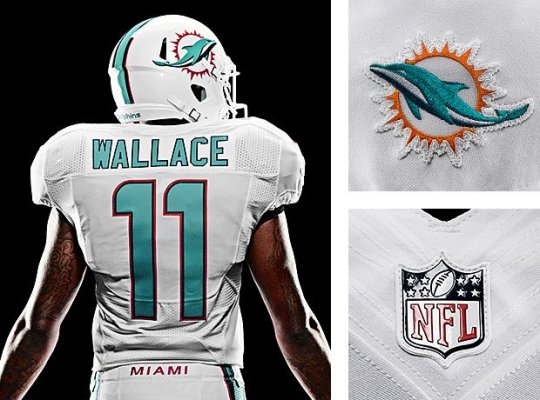
Or like the Dolphins with the 'MIAMI' tramp stamp on the pants.

Wallace


The only thing I dislike about or current unis is the green shield with the Nike swoosh; it just stands out way too much. It would look a lot better in grey/white feathers with a green border, just like the numbers on the home jerseys.
 

KARAVARUS

Active member
Joined
Sep 28, 2009
Messages
3,513
Reaction score
1
Location
Omaha, NE
HoustonHawk82":1z1ptaxy said:
KARAVARUS":1z1ptaxy said:
Loved the originals, always will. loved the seahawk all blue 2002-2011, but looking back at them in videos now, AWFUL! love the new ones and will hate it when we change them again.

I cannot stand the all whites. I like the gray, but with only half of them gray, the other half blue. I don't care if it's tops or bottoms. I used to think all blue was my favorite, because it meant we're at home...but the white on blue pants is my favorite now. you know why. maybe we win in Arizona with all blue and then we'll be back to that for me, forever.

I do think Nike's current looks and fits could revive the originals and make them pretty sick. I would love to watch earl, russ, kam, sherms, all running around in the original look. how cool.

So, we would be the "Home team" at this year's SB?

YES!!!!!!!!!!!!!!!!!!!!!!!!!!!!!!!!!!!!!!!!!!!!!!!!!!!!!!!!!!!!!!!!!!!!!!!!!!!!!!!!!!!!!!!!!!!!!!!!!!!!
 
Top